Introduction
You can find several use cases involving time series forecasting in business these days. Be it forecasting sales, website traffic, number of customers or even weather, most of the prediction problems we across has a time dimension around it.
Learning how to solve business problems involving time dimension using data science is a quite useful skill for data scientists. When I started my career, my go to approach towards time series problems was using classical time series approaches like ARIMA, SARIMA etc. However, over the years I have shifted my approach towards using non linear models like XGBoost because of several benefits which I’ll explain throughout this post.
Note: The following case study given in this post is based on a hypothetical data set. For business context, consider it as coming from a ride sharing app.
Table of Contents
- Business Problem
- Hypothesis
- Data Exploration
- Feature Engineering
- Model Training and Evaluation
- Improvement Ideas
1. Business Problem
For a ride sharing app, the most critical aspect of the business is to ensure the matching riders with drivers efficiently. It should be efficient in a way that:
- The riders don’t wait long to find a driver
- The drivers are able to complete many successful rides daily
With this context, the problem we are going to solve is: How can we better guide the drivers towards areas with higher expected demand at given time and location.
2. Hypothesis
Defining hypothesis early in a data science project is quite useful. It helps to list down the factors (or say model features) which we could use in solving the problem. Also, since we haven’t looked at the data till now, it also avoids availability bias in our thinking process.
Let’s think of some features which can help in solving our business problem:
- historical riders demand
- temporal information (date, time, weekday etc)
- promotional/discount offer
- weather conditions
- rider location
Now we know, what data we need to start modeling the problem.
But, lets take a step back. There’s one more thing to do. We can’t directly model the business problem given to us. We must reframe the business problem it into a measurable data science problem.
Based on my business understanding of the given problem, one way to create a data science problem statement is: Predict the rider booking demand for a given location at a certain hour.
Now, this sounds like a doable time series (regression) problem we can model using data and ML algorithms.
3. Data Exploration
Let’s check what data is given to us:
| start_time | start_latitude | start_longitude | end_latitude | end_longitude | ride_value |
|---|---|---|---|---|---|
| 2022-03-26T06:37:29.854982000 | 59.434512 | 24.775047 | 59.432783 | 24.745426 | 0.413750 |
| 2022-03-02T22:16:34.715015000 | 59.398647 | 24.682734 | 59.446545 | 24.740912 | 1.555000 |
| 2022-03-23T18:18:16.737000000 | 59.426320 | 24.738518 | 59.421385 | 24.731641 | 0.162448 |
| 2022-03-08T07:00:44.215596000 | 59.417252 | 24.743914 | 59.431809 | 24.743137 | 0.404000 |
| 2022-03-09T07:45:51.067463000 | 59.411823 | 24.737616 | 59.445297 | 24.697369 | 1.083750 |
Following is the description of the information given to us in the data set:
- start_time: start time of the ride
- start_latitude: start latitude of the ride
- start_longitude: start longitude of the ride
- end_latitude: end latitude of the ride
- end_longitude: end longitude of the ride
- ride_value: value of the ride
We find the data has only six columns. But, where is the target (dependent variable) ? Also, how can we predict for a certain location ? We need to do some additional work to prepare the data such as:
- Convert the ride coordinates into grid (each grid can be considered an area)
- Create a target variable (number of rides) by aggregating on the grids
Lets start coding!
import pandas as pd
import numpy as np
import matplotlib.pyplot as plt
import geopy.distance
from h3 import h3
import catboost
from sklearn import metrics
import shap
import seaborn as sns
import folium

# read data set
df = pd.read_csv('dscasestudy.csv')
print(df.shape)
# 511324, 6

# Create location grid
resolution = 7
df['location_grid']=df.apply(lambda x : h3.geo_to_h3(x['start_lat'],x['start_lng'],resolution),axis=1)

# Create target variable
df_agg = df.groupby(['location_grid','start_date','hour']).agg(rider_count = ('location_grid', 'size')).reset_index()
First of all, let’s analyse the target variable.
# target variable distribution
sns.displot(x='rider_count', data=df_agg, aspect=3, height=4)
We see the following:
- The target variable is right skewed.
- There are lots of grids with very few (<= 5) rider_count value.
Since the target variable is skewed, we apply a log transformation to reduce the skewness and variance.

Let’s look at some temporal distribution of the target variable rider_count and find out if there are any weekly or daily patterns.

We see a strong weekly pattern with a clear drop in number of rides on day 7/14/21. Also, the peak number of rides tend to increase throughout the month.
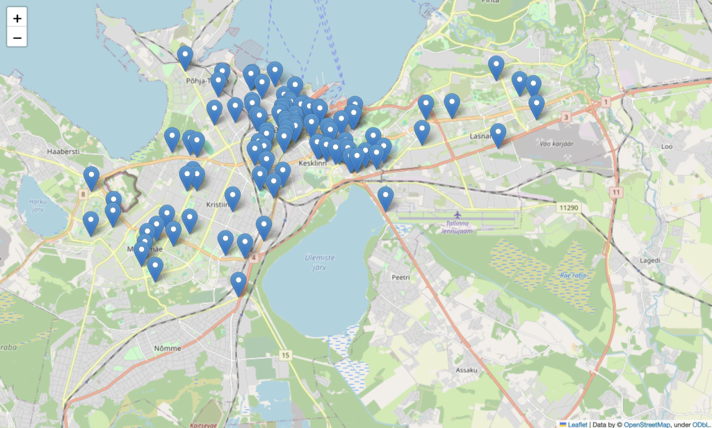
I am curious to find out from which part of the city most of these rides are coming? Reason being, if we have 90% of the rides coming from city center, we might build two different models: one for city center and other for rest. Let’s check!

We do see that lots of rides are happening in the center of the city, with few ones spread across the city.
4. Feature Engineering
In a time series problem, creating features can be a bit challenging, specially when the data provided doesn’t have continuous dates. On further investigation, we found the data set given to us have missing dates. In order to tackle such cases, we’ll do the following:
- Create a master data set containing all dates
- Do a left join and fill the missing dates with zero (we assume no rides were booked on those)
- Using the master data set, calculate the historical features
# Creating Master Data to make the dates continuous in order to create lag and rolling median features
from itertools import product

# Create a list of locations
locations = list(df_agg.location_grid.unique())

# Create a list of dates from 01/03/2022 to 28/03/2022
dates = pd.date_range(start='2022-03-01', end='2022-03-28')

## Create Master Data, Each grid have 28 days and each days have 24 days
hours = list(range(24))

# Create a DataFrame with all possible combinations of locations, dates, and hours
all_combinations = list(product(locations, dates, hours))
df_master = pd.DataFrame(all_combinations, columns=['location_grid', 'start_date', 'hour'])

# Do left join
df_agg['start_date']= pd.to_datetime(df_agg['start_date'])
df_complete=df_master.merge(df_agg,on=['location_grid','start_date','hour'],how='left')
df_complete=df_complete.fillna(0)
df_complete.head()| location_grid | start_date | hour | rider_count |
|---|---|---|---|
| 87089b014ffffff | 2022-03-01 00:00:00 | 0 | 0 |
| 87089b014ffffff | 2022-03-01 00:00:00 | 1 | 0 |
| 87089b014ffffff | 2022-03-01 00:00:00 | 2 | 0 |
| 87089b014ffffff | 2022-03-01 00:00:00 | 3 | 0 |
| 87089b014ffffff | 2022-03-01 00:00:00 | 4 | 0 |
As you can see, in the master dataset above, we have generated missing data for each location_grid, date and hour combination. Introducing this missing data will ensure that historical feature computation is accurate (shown below).
# Adding Day of week column
df_complete['day']=df_complete['start_date'].dt.weekday

# Calculate features : Lag features and Rolling Median of rider count for each location
shift_range = [1,3,6,24,48]
rolling_window=[3,5,10,15,24,48]
df_complete=df_complete.sort_values(by=['location_grid','start_date','hour'])
def create_ts_features(df: pd.DataFrame) -> pd.DataFrame:
    """Calculates lag and rolling features."""
    for shift in tqdm(shift_range):
      df[f"shift_lag_{shift}"] = df.groupby('location_grid')['rider_count'].transform(lambda x: x.shift(shift))

    for win in rolling_window:
      df[f'rolling_median_{win}'] = df.groupby(['location_grid'])['rider_count'].transform(lambda x: x.shift(1).rolling(win).median())

    return df

df_complete = create_ts_features(df_complete)
In the code above, we sort the data by start_date, hour to ensure the rolling and lag functions work correctly. We calculate historical features such as:
- Rider count 1 hour ago, 3 hour ago, 6 hour ago and so on…
- Average rider count in last 3 hours, last 5 hours, last 10 hours and so on…
Some more technical details:
- We need to remove the samples where the lag and rolling features are all empty.
- Since some of the samples which have rider_count = 0 (which were artificially created) should be removed before we do training.
# Removing the rows with all column as NA and fill remaining NA column as 0
df_model= df_complete.dropna(how='all', subset=['shift_lag_24', 'shift_lag_48','rolling_median_3','rolling_median_5','rolling_median_10'])
df_model=df_model.fillna(0)

# Removing rows where rider count is 0 which came due to merging with master data to make dates continuous in order to calculate lag and rolling features
df_model=df_model[df_model['rider_count']!=0]
5. Model Training and Evaluation
Before model training, we should create different data split to ensure model evaluation is done properly. For a time series problem, a time based split usually works fine.

# Create Train Test and Validation Splits
df_model['start_date']=pd.to_datetime(df_model['start_date'])
cutoff = df_model['start_date'].max() - pd.to_timedelta(14, unit = 'D')
print(f'{cutoff=}')
test_cutoff=df_model['start_date'].max()- pd.to_timedelta(7, unit = 'D')
print(f'{test_cutoff=}')

xtrain = df_model[df_model['start_date'].between('2022-01-03',cutoff) ].copy()
xvalid = df_model[(df_model['start_date'] > cutoff) & (df_model['start_date'] < test_cutoff)].copy()
xtest = df_model[df_model['start_date'] >= test_cutoff].copy()
xtrain.shape, xvalid.shape,xtest.shape
It is usually a good practice to start with a baseline model. In our case, we’ll consider the previous hour rider_count value as a baseline model. Having a baseline helps us understand how much improvement does the machine learning model bring.
def calculated_adj_rsquared(y_true, y_pred, df):
    r_squared = metrics.r2_score(y_true, y_pred)
    adj_r = 1 - (1-r_squared)*(len(y_true)-1)/(len(y_true)-df.shape[1]-1)
    return f"Adjusted R^2: {adj_r:.4f}"

pred = xvalid['shift_lag_1']
print(f'MAPE error: {metrics.mean_absolute_percentage_error(xvalid["rider_count"], pred)*100:.2f}%')
print(f"Model Test MAE: {metrics.mean_absolute_error(xvalid['rider_count'], pred)}")
calculated_adj_rsquared(xvalid['rider_count'], pred, xvalid)

MAPE error: 60.44%
Model Test MAE: 5.119927395306625

Adjusted R^2: 0.9393
Wow! The baseline already seems quite strong. One feature alone is able to explain 93% variance in the dependent variable. Anyways, this is expected since in our normal lives too, what we did in the last hour usually influences our next hour activity. Lets train a model now. We’ll use catboost library.
# select the features to use
num_features =['hour','shift_lag_1', 'shift_lag_3',
       'shift_lag_6','shift_lag_24','shift_lag_48','rolling_median_3',
       'rolling_median_5', 'rolling_median_10', 'rolling_median_15',
       'rolling_median_24', 'rolling_median_48']
cat_features=['location_grid','day']
features = num_features+ cat_features
Catboost requires separate list of numerical and categorical features. One of the advantages of using catboost is that it can handle raw categorical features internally.
# train the model on log transformed target variable
cat_train = catboost.Pool(
            data=xtrain[features],
            label=np.log1p(xtrain['rider_count']),
            cat_features=cat_features)
cat_test = catboost.Pool(
            data=xvalid[features],
            label=np.log1p(xvalid['rider_count']),
            cat_features=cat_features)

model = catboost.CatBoostRegressor(
    iterations=10000,
    learning_rate=0.01,
    colsample_bylevel=0.7,
    subsample=0.7,
    depth=4,
    random_seed=1,
    eval_metric='RMSE',
)

model.fit(cat_train,
          eval_set=[cat_test],
          use_best_model=True,
          verbose_eval=500,
          early_stopping_rounds=50)

0:	learn: 1.1837873	test: 1.2289138	best: 1.2289138 (0)	total: 55.5ms	remaining: 9m 14s
500:	learn: 0.3374208	test: 0.3386316	best: 0.3386316 (500)	total: 3.35s	remaining: 1m 3s
1000:	learn: 0.3236093	test: 0.3259324	best: 0.3259324 (1000)	total: 6.74s	remaining: 1m
1500:	learn: 0.3163504	test: 0.3198157	best: 0.3198157 (1500)	total: 15s	remaining: 1m 25s
2000:	learn: 0.3122722	test: 0.3172888	best: 0.3172888 (2000)	total: 18.8s	remaining: 1m 15s
2500:	learn: 0.3094581	test: 0.3157580	best: 0.3157580 (2500)	total: 23.5s	remaining: 1m 10s
3000:	learn: 0.3072566	test: 0.3147646	best: 0.3147646 (3000)	total: 28s	remaining: 1m 5s
3500:	learn: 0.3054573	test: 0.3140353	best: 0.3140353 (3500)	total: 31.5s	remaining: 58.5s
4000:	learn: 0.3038844	test: 0.3135471	best: 0.3135471 (4000)	total: 38.2s	remaining: 57.2s
4500:	learn: 0.3025143	test: 0.3131117	best: 0.3131117 (4500)	total: 43.7s	remaining: 53.3s
5000:	learn: 0.3012333	test: 0.3127479	best: 0.3127479 (5000)	total: 49.8s	remaining: 49.8s
5500:	learn: 0.3000466	test: 0.3124487	best: 0.3124487 (5497)	total: 53.1s	remaining: 43.5s
6000:	learn: 0.2989646	test: 0.3122281	best: 0.3122273 (5984)	total: 56.4s	remaining: 37.6s
6500:	learn: 0.2978673	test: 0.3120065	best: 0.3120020 (6489)	total: 1m	remaining: 32.7s
7000:	learn: 0.2969017	test: 0.3117524	best: 0.3117523 (6998)	total: 1m 4s	remaining: 27.7s
Stopped by overfitting detector  (50 iterations wait)

bestTest = 0.3116317148
bestIteration = 7356
Let’s check the model performance on validation set.
pred = np.expm1(model.predict(xvalid[features]))

print(f'MAPE error: {metrics.mean_absolute_percentage_error(xvalid["rider_count"], pred)*100:.2f}%')
print(f"Model Test MAE: {metrics.mean_absolute_error(xvalid['rider_count'], pred)}")
calculated_adj_rsquared(xvalid['rider_count'], pred, xvalid)

MAPE error: 34.32%
Model Test MAE: 3.0848148214835884

Adjusted R^2: 0.9771
We see the catboost model provides significant improvement over baseline model. MAPE reduced by 40% and adjusted R2 also improved by 5%.
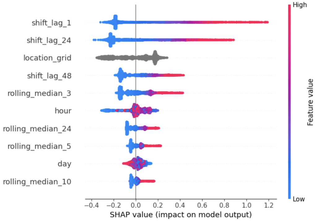
Lets check the feature importance plot using shapely. Shapely uses game theory to calculate feature importance.
## check feature importance
explainer = shap.TreeExplainer(model)
shap_values = explainer.shap_values(xvalid[features])
shap.summary_plot(shap_values, xvalid[features], max_display=10)
We gather the following insights from the shap importance plot:
- Higher values of shift_lag_1 feature leads to higher values of rider_count
- Higher values of shift_lag_24 feature leads to higher values of rider_count
- Similarly, for all other features we see a monotonic relationship in input features with the target variable
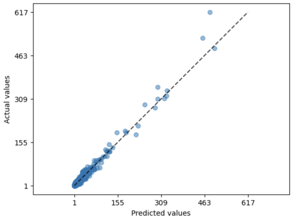
In regression problem, it is usually a good practice to plot the error and see their distribution. Lets do it.
metrics.PredictionErrorDisplay.from_predictions(
    xvalid['rider_count'],
    pred,
    kind="actual_vs_predicted",
    scatter_kwargs={"alpha": 0.5},
)
I am not surprised looking at this plot. Since we already saw the model is performing well, we expect the actual and predicted values to correlated strongly.
One last think to check is, how is our model doing on test set? Test set is not touched in the entire modeling process. Usually, the performance we see on test set is set as a benchmark for model’s performance in the real world (post deployment).
# Prediction on Test
pred = np.expm1(model.predict(xtest[features]))
print(f'MAPE error: {metrics.mean_absolute_percentage_error(xtest["rider_count"], pred)*100:.2f}%')
print(f"Model Test MAE: {metrics.mean_absolute_error(xtest['rider_count'], pred)}")
calculated_adj_rsquared(xtest['rider_count'], pred, xtest)

MAPE error: 34.28%
Model Test MAE: 3.25369541049924

Adjusted R^2: 0.9714
We should be happy finding the model performance stable on validation and test set. The choice of metrics in regression problem depends on the data scientist. But in my experience, I usually include the following metrics (almost always):

- Mean Absolute Error (MAE): Because it is less affected by outlier and the error can be translated in the same units as target variable. In our case, we have a skewed distribution, MAE fits better to our needs.
- Mean Absolute Percentage Error (MAPE): Because it is easier to communicate to the stakeholder in the company. This metrics can be communicated in terms of accuracy. For example: Our model above is roughly 66% accurate in giving predictions.
6. Improvement Ideas
Until this point, we have trained and evaluated the model. All good so far! What if you are asked what additional data points would you require to further improve the model ?
I can think of the following data sources to use:
- Holidays information
- Weather information
- Distance of nearest of point of attraction
- Distance of sea from the grid
- Population information
- Competitors Coverage Information
7. Summary
Solving a machine learning problem is a time taking process. There are several steps a data scientist should keep in mind to make sure the model being delivered is performant.
In this post, we did a case study on a time series problem which was given to us from a business problem point of view. Having worked as a data scientist in several product companies, I can confirm a situation like this is quite common. Usually, you never get a structured data science problem to solve.
In case you have questions/suggestions, feel free to write them below in the comments section. Stay tuned for more posts:)
You are a savior. Tomorrow I have to present a regression case study in my class.
Nice and easy to follow. Really informative and comprehensive read.